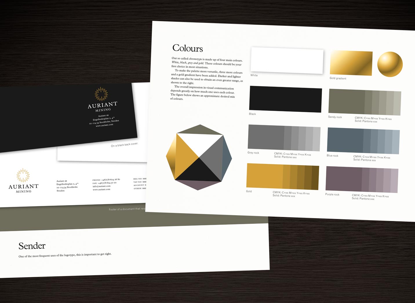
Auriant Mining corporate identity
Whenever we are asked to improve the visual identity of a company or a product (or a place for that matter), we always begin with the basics. When designing the new Auriant logotype, we even broke it down into atoms. (The symbol is actually a stylized version of the gold atom.)
PROJECT FACTS
Auriant web site: www.auriant.com


